
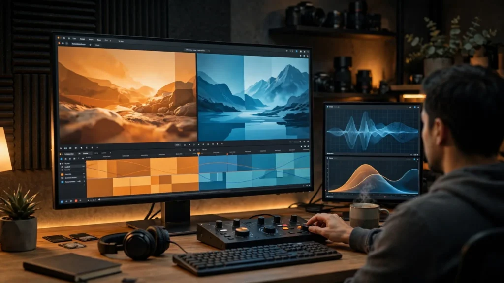
Cut three AI shots of the same kitchen together and you’ll see it immediately: shot one is warm, shot two is somehow green, shot three looks like a different apartment at a different time of day. Same prompt. Same character. Three white balances.
Color shift between generations isn’t a bug you hit once. It’s the default behavior of models that invent a fresh image every time they run. The creators who handle it well aren’t using secret tools — they prevent what they can at the prompt, anchor what they can’t, and normalize the rest in the edit before any creative grade goes on.
Why Each Generation Invents Its Own White Balance
A camera records light. A video model imagines it — and it re-imagines it on every run. Nothing in a text prompt like “cozy kitchen” pins down an exact color temperature, so the model makes a fresh executive decision each time: this run’s kitchen is golden-hour warm, the next run’s is overcast cool. Neither is wrong. Together in a cut, both are.
The shift sneaks in through more doors than temperature alone:
- Wardrobe costs you. Describe the same red jacket twice and you’ll get two reds — one brick, one cherry — because “red” is a neighborhood, not an address.
- Skin follows the room. The model’s sense of skin tone is relative to the light it invented. Warmer room, tanner face. Cooler room, paler face. Cut between them and your character appears to change ethnicity between shots. This one matters — viewers notice faces before anything.
- Time re-rolls. “Afternoon light” at generation one and “afternoon light” at generation five can be an hour apart in the model’s imagination.
- Even the same seed won’t save you once the prompt changes for the next shot, which it always does. New shot description, new color roll of the dice.
Understanding this reframes the problem. You’re not fixing a defect; you’re directing a crew member with no memory. Direction means saying things explicitly, the same way, every time — and then supervising in the edit. That’s the whole article, really. The rest is technique.
Preventing Shift At The Prompt: Palette Words That Travel
The cheapest color correction is the one you never have to make, so start at the prompt. The technique is a fixed palette block: a short string of color language that gets copy-pasted, unchanged, into every shot of a scene. Mine reads something like: “warm late-afternoon light, golden skin tones, muted teal shadows, soft contrast, natural color.” Yours will differ by project. What matters is that it’s identical across the scene’s shots.
Words that travel well — meaning the model interprets them consistently run to run:
- A named time and light source: “window light from the left, late afternoon” beats “nice lighting” every time. Specific sources produce specific color.
- A temperature word plus a skin word: “warm light, natural warm skin tones.” You’re pinning the two things viewers compare across cuts.
- A saturation instruction: “muted colors” or “rich saturated color” — pick one per project. Saturation drift is as visible as temperature drift and nobody talks about it.
- A contrast character: “soft low contrast” or “punchy high contrast.” Two shots with different contrast curves won’t match even at identical white balance.
- Wardrobe color anchors: describe colors with a material or object attached — “rust-orange corduroy jacket” drifts less than “orange jacket.”
Tools with strong reference support help here too. In Seedance 2.5, feeding the same character and scene references into each shot carries color information along with identity — the reference frame’s palette nudges every generation toward the same answer. In Veo, starting shots from an approved frame does similar work. Prevention in the prompt plus anchors in the references gets you surprisingly far — often within range of a light normalization instead of a rescue job.
One caution: don’t fight shift by over-specifying. A prompt stuffed with twelve color adjectives gives the model twelve chances to weight them differently per run. Four or five palette words, repeated verbatim, beat a paragraph. Consistency of instruction creates consistency of output.
Reference Frames As Color Anchors
When a scene matters, I don’t rely on words alone. I pick one approved frame — usually the first good generation of the scene, or a storyboard frame I’ve already approved — and treat it as the scene’s color anchor. Every later shot in that scene gets generated from, extended from, or at minimum compared against that frame.
Practically, this looks like:
- Generate shot one. Approve its color, not just its content. This frame is now the law for the scene.
- Use it as an image reference or start frame for shot two where the tool allows. The model inherits the palette instead of inventing one.
- Where it doesn’t allow, screenshot the anchor and keep it on screen during review. Generate, compare, regenerate-with-notes: “match the warm window light of the anchor.” Some tools accept an image purely as a style/color reference even when they can’t animate from it.
- Save the anchor into the project folder, named obviously — scene03_COLOR-ANCHOR.png. Two weeks later, on revision day, you will thank yourself.
The storyboard-first workflow makes this almost free: storyboard frames are approved before video generation starts, so they can double as palette references. My storyboards carry the color of the finished piece, not just the blocking. A grey sketch can’t anchor color. A finished frame can.
Anchors have limits, and I’ll be honest about them. A radically different angle, or a move from interior to exterior, will drift no matter what you feed the model. Anchors narrow the gap; they don’t close it. Closing it is the edit’s job — which is fine, because the edit is very good at it when the gap is small.
Reading The Mismatch: Temperature, Saturation, Contrast
Before fixing anything, learn to name what you’re seeing, because each mismatch has a different fix and the wrong fix makes new problems. Pull the shots into Premiere Pro, park them adjacent on the timeline, and flip between them. Three questions:
Temperature: Is one shot warmer (orange) or cooler (blue) than its neighbor? Check on something that should be neutral — a white shirt, a grey wall, a countertop. Faces lie about temperature, because we expect skin warm. Whites don’t lie.
Saturation: Do the colors have the same intensity? The classic pair is one shot where the jacket pops and the next where it sulks. Saturation mismatch often hides inside what people call a temperature problem, so check it separately: same jacket, same red-ness?
Contrast: Do the blacks and whites land in the same place? One generation’s “moody” is another’s “flat.” Compare the darkest shadow and the brightest highlight across the cut. Contrast mismatch is the one viewers describe as “the second shot looks cheaper” — and frequently it is just curve disagreement.
Premiere’s scopes make this objective when your eyes get tired: the waveform shows contrast placement, the vectorscope shows saturation and hue drift. I won’t pretend I live in the scopes — I check whites and faces by eye first — but on a long scene the scopes settle arguments my eyes keep flip-flopping on. If you want the deeper craft of this, the guide to color grading AI footage builds directly on this diagnosis step.
Pre-Edit Normalisation In Premiere
Order matters here, and this is the step people skip: normalize before you grade. A creative grade applied over mismatched shots just makes three differently-shifted shots with the same LUT on top. Normalization means making the shots agree with each other in a neutral way; grading comes after and gives them a shared look.
My normalization pass, shot by shot, comparing always to the scene’s anchor shot:
- White balance first. Use the white balance selector on a should-be-neutral object, or nudge temperature/tint manually until whites match the anchor. Small moves — big moves mean the generation needs an anchor-based redo, not a rescue.
- Exposure and contrast second. Match the anchor’s black point and highlight rolloff. Lumetri’s basic sliders are enough; you’re aligning, not styling.
- Saturation third. Bring the loud shot down or the quiet shot up until wardrobe colors agree across the cut.
- Skin last, checked separately. After the neutrals match, look only at faces across the cut. If skin still jumps, a gentle hue adjustment on the skin range fixes what white balance couldn’t, because the model’s skin invention isn’t purely a temperature issue.
- Copy the correction, don’t re-invent it. Once shot two matches the anchor, paste those correction settings as the starting point for shot three, then adjust. Every shot in the scene gets corrected toward one reference, not toward your mood that minute.
Then — only then — the creative grade goes across the scene, ideally as an adjustment layer so every shot receives the identical look and the normalization underneath keeps them honest. If a revision changes one shot later, the layering means you re-normalize one clip instead of re-grading a scene. This two-layer discipline is the backbone of grading AI footage that actually survives cutting.
When A Unifying Grade Forgives Everything
Here’s the part nobody believes until they try it: a strong, intentional grade hides a multitude of sins. Small temperature disagreements, mild saturation drift — under a decisive look (a warm filmic pass, a clean teal-neutral, whatever suits the piece) the audience’s eye accepts the variation as photography. Real films shot on real cameras have shot-to-shot variation too; colorists exist because cameras disagree. Viewers are trained by a century of cinema to accept graded variation and to reject only raw disagreement.
One more habit worth stealing before the standard talk: build the palette into your scene planning, not just your prompts. When my storyboard frames for a scene are approved, they’ve already made the big color decisions — warm kitchen, cool street, whatever the story needs — and the generation prompts inherit that decision instead of improvising it per shot. Scenes planned visually drift less than scenes planned in words alone, because a picture is a more complete instruction than an adjective. If your current boards are rough sketches, that’s fine; even a rough board can carry a color note in the corner (“Scene 3 = warm, golden, soft”) that you paste into every prompt for that scene. The consistency you’re buying is in the repeating, not in the artistry of the note.
And keep expectations honest about multi-character scenes. Two characters generated in separate shots in the same room is the hardest matching case there is — two invented skin tones, two invented relationships to the light. This is where I lean hardest on anchors: generate the two-shot first, approve it, and let its frame referee the singles that follow. If a production has one scene that must match perfectly, spend your anchor effort there and accept looser matches in the cutaway inserts nobody compares directly.
So the practical standard isn’t perfection. It’s this: normalize until the shots agree neutrally, then grade until they belong to the same film. If after normalization two shots still fight — one stubbornly green, one determinedly magenta on skin — that’s the rare case worth regenerating with the anchor attached, because fighting grades produce waxy, over-corrected faces that no LUT forgives.
Keep the whole thing in proportion. Prompt with palette words that travel, anchor scenes to an approved frame, diagnose temperature/saturation/contrast separately, normalize in Premiere Pro before you grade, and let a unifying grade do the forgiving it’s good at. Do those five things and the “three different kitchens” problem quietly stops appearing in your work — not because the models got consistent, but because you did.