
Here is what most creators get wrong about Shorts. They think the video gets watched the same way as a long video. It doesn’t. Nobody is choosing Shorts the way they choose a YouTube video. A viewer swiping the feed gives you a moving first frame and, honestly, about half a second. Blink and you’re gone.
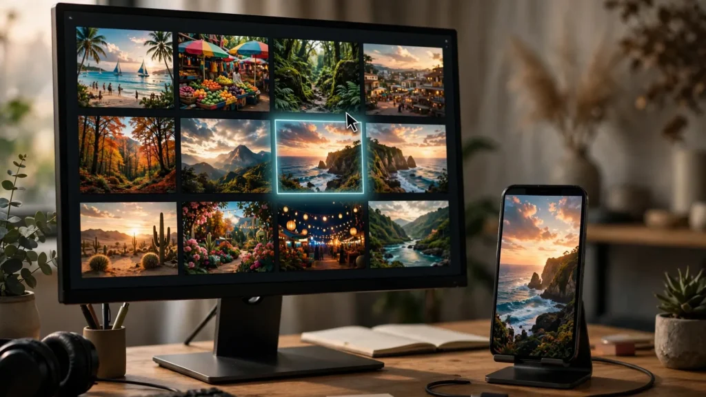
But — and this is the part people miss — a huge share of Shorts views don’t start in the feed at all. Search results. Channel pages. Shelves. Suggested panels. Places where your video sits frozen as a single still frame next to a title, waiting to be judged like a poster. In those places your cover isn’t decoration. It’s the whole pitch. One frame doing the job of a salesperson.
We learned this the embarrassing way. Our covers used to be whatever the platform grabbed. Then we started treating the cover frame as an actual deliverable: chosen deliberately in Premiere Pro, exported clean, checked at the size viewers actually see it. This guide is the full routine — how we pick the frame, how text behaves on covers (spoiler: usually badly), how each platform handles covers differently as of writing, and when a designed cover beats anything the video itself can offer. One caveat: platforms change their cover options all the time, so check the current upload options in Studio or the app before you rely on any specific feature.
The Cover Is A Poster, Not A Screenshot
The most common cover mistake? Letting the platform pick. Automated frame grabs take the frame at some fixed timestamp or the midpoint, and they have zero opinions about faces, blur, or story. None. So you end up with a blink, a motion smear, or the least informative second of your video representing it forever in search. We’ve all been there. It hurts to look at.
A poster has one job: make a single clear promise in a fraction of a second, at small size, in a grid of competitors. That job rules everything that follows.
- One subject. One face, one animal, one object. Two subjects at thumbnail size read as clutter.
- One emotion or question. Surprise, delight, tension, before-and-after. If the frame cannot be described in three words, it is not a cover yet.
- Readable at tiny size. Covers get seen at sizes where detail dies. Big shapes, strong contrast and clear silhouettes survive. Subtlety does not.
- Honest to the video. The frame must pay off inside the first seconds of the short, or viewers leave and the algorithm learns the wrong lesson about your content.
Funny thing: our workflow helps here in a way we never expected. Because we storyboard before generating with Seedance or Veo, every project already has composed still frames representing its key beats. So the cover hunt starts there. Which storyboard beat was designed to sell the video? Usually one of them was. Then the edit confirms it exists as a real, clean frame.
Choosing The Frame: Face, Motion, Mystery
Inside Premiere, scrub the finished timeline slowly. Judge frames like a viewer who will never press play — because most of them won’t. Three kinds of frames consistently earn the click in our delivery reviews.
The face frame. Eyes open, expression mid-emotion, face large in frame. For our animal content, the puppy’s face mid-reaction (startled by the glowing fish, delighted by a splash) outperforms every clever composition we’ve tried. Faces are simply the fastest signal a scrolling human brain processes. So if your short has a face — human or animal — your cover search starts there. The burden of proof sits on anything else.
The motion frame. The peak of an action, frozen clean: water mid-splash, the toy mid-leap, confetti at full spread. Motion frames promise energy. But they carry a trap: motion blur. A frame that feels electric in playback can be a smeared mess as a still. Judge the frozen frame alone, on its own merits. If the subject’s edges are mush, step a few frames earlier or later. Peak action almost always has a sharp neighbour hiding nearby.
The mystery frame. A setup without the payoff: the closed box, the paw reaching in, the before state of a transformation. Mystery frames lean on the title to complete the question, so they only work when cover and title are planned as a pair. Used well, they pull clicks from browse surfaces. Used with a flat title, they confuse and die quietly.
Whatever the type, run the same three checks. First: shrink it to phone-grid size and confirm it still reads. Second: confirm the subject sits centre-safe so crops in different surfaces don’t amputate it (the safe-zone logic from our delivery work applies to covers too). Third: confirm the frame appears early enough in the video that a viewer arriving from the cover feels rewarded, not baited.
Exporting A Clean Still From Premiere
A chosen frame still has to leave Premiere as a clean, full-quality image. Takes under a minute once it’s a habit. Here’s the routine:
- Park the playhead exactly on the frame. Use the timeline at full resolution, not a paused proxy blur. Step frame by frame around the moment; covers are chosen on exact frames, not near enough.
- Export Frame. Premiere’s Export Frame button (the camera icon in the Program Monitor, or the shortcut your layout shows) saves a still. Choose PNG for a lossless master still. Name it with the project and the word cover so future-you finds it without archaeology.
- Check the export at 100%. Open the PNG and look at eyes, edges and text areas. Timeline playback hides softness that a still exposes. If it is soft, the frame is wrong, not the export.
- Make the platform copies. Keep the PNG as the master still. Export a high-quality JPG at the dimensions the surface needs (vertical 1080×1920 covers for Shorts-style use, and per-surface sizes where the platform asks). Avoid re-exporting a still from a compressed video copy later; always return to the PNG or the timeline.
- Grade consistency. The still inherits your Lumetri grade from the timeline, which is what you want: the cover should look like the video’s world, not a brighter cousin. If you punch up contrast for the cover, do it on a copy and keep the promise honest.
Text On Covers: Less, Bigger, Honest
Text on covers tempts everyone. The title sits far from the image in some surfaces, and the urge to cram the pitch into the picture is strong. Resist most of it.
Most covers need zero text. A strong face or mystery frame plus the platform title does the job, and baked text shrinks into noise at grid size. Try this: go watch successful covers in your niche at actual size and count how many carry words. Fewer than you assumed. Bet on it.
When text earns its place, keep it to two or three words. The text has to be readable at the smallest size the surface shows. In practice that means very large type, high contrast against its background, and a backing shape when the frame behind it is busy. If you have to squint in Premiere at full size, it’s already dead in the feed.
Never duplicate the title. Cover text that repeats the title wastes the only two communication slots you get. Make them work as a pair: title asks, cover shows; cover teases, title names. Same goes for our shorts — the caption text inside the video and the cover are separate tools. Don’t spend both delivering the same words.
Keep it honest. Text promising a reveal the video doesn’t contain is the fastest way to train viewers (and the recommendation system) to distrust your covers. Shorts live on satisfaction signals after the click. A cover that over-promises wins one view and taxes the next fifty. Not worth it.
In Premiere, build cover text as its own graphic on a copy of the frame or in your image editor — never baked into the master still. You want the clean frame and the text version as separate files, because different surfaces reward different amounts of text. One platform’s perfect cover is another’s cluttered one. And where a platform lets you pick the cover frame directly in the app, a clean in-video frame often beats uploaded text art anyway. More on that next.
Platform Differences In Cover Handling
Covers are where cross-posting stops being copy-paste. Each platform gives you different control. As of writing, here’s how things stand — and it changes often enough that you should verify the current options in each app or Studio before a launch:
YouTube Shorts. Historically the most limited: the Shorts cover is a frame from the video, chosen through the upload flow on mobile in many regions, rather than a freely uploaded custom thumbnail like long-form YouTube allows. YouTube has been expanding creator control here over time, and availability varies, so check what your Studio and app currently offer. The practical response is the same either way: make sure your video contains a strong, clean frame worth choosing, ideally early, and design the first seconds knowing one of them may become the public face of the piece.
TikTok. TikTok lets you select a cover frame from the video during posting and offers cover templates and text styling in-app. Your chosen in-video frame matters directly here. Creators who design one strong moment into the edit (a beat where the subject faces camera, mid-expression, well-lit) get a good TikTok cover almost for free.
Instagram Reels. Reels allows cover selection from the video or an uploaded image in many posting flows, and the cover also serves as the grid image on your profile, possibly cropped. That grid crop is the quiet killer: a vertical cover with the subject low or high can lose its head in the profile grid. Centre-safe subject placement protects you here as well, the same discipline covered in our multi-platform delivery specs.
The delivery habit that survives all three: produce one approved master cover still, know which platforms will accept it, and where a platform insists on an in-video frame, make sure that frame exists and is easy to find. Scrubbing a finished short hunting for a usable frame under posting pressure is how mid-blink covers happen. Choosing it during the edit, calmly — that’s the whole trick.
When A Designed Cover Beats A Frame
Most shorts should use a real frame. It’s honest, it’s fast, and it matches the video’s world. A designed cover — a composite or treated image built deliberately — earns its extra work in specific situations:
- Series branding. A recurring series benefits from a recognisable cover system: same layout, same type treatment, changing subject. Viewers learn to spot your series in a grid. Design buys recognition that raw frames cannot.
- The best moment cannot freeze cleanly. Some payoffs (a splash, a tumble, a fast transformation) are all motion blur at every frozen instant. Compositing the sharpest subject frame over the moment’s background can represent the beat honestly when no single frame can.
- Compilation and repost surfaces. When shorts get bundled or featured on surfaces with larger cover displays, the extra size rewards a composed poster and punishes a grabbed frame.
- The frame needs one clear push. Slight background cleanup, subject enlargement, or contrast separation done on a copy of the real frame, kept truthful, can rescue an otherwise strong moment from a busy background. This is design in service of the frame, and it is usually the right amount.
Our rule of thumb is simple. Start with the frame. Design only when the frame can’t do the job — and even then, build it from the frame. The workflow from generation to delivery stays one chain, which is the same philosophy behind our end-to-end prompt-to-final-cut workflow: every stage hands the next stage something it can actually use.
Frequently Asked Questions
Can You Upload A Custom Thumbnail For YouTube Shorts?
Shorts cover control has historically been frame-based rather than the free custom thumbnail upload that long-form YouTube allows, with options expanding over time and varying by region and app version. Check your current Studio and mobile upload flow for what is available to you today. Either way, the safe habit is identical: make sure the video itself contains a strong clean frame early, and export a master cover still for the platforms that accept uploads.
How Do I Choose The Best Frame For A Shorts Cover?
Scrub the finished edit in Premiere and judge frozen frames at small size. Prioritise a face mid-expression, eyes open, large in frame. Next best is the sharp peak of the main action, checked for motion blur frame by frame. A mystery setup frame works when the title completes the question. The winner reads in three words at grid size and appears early in the video so the click feels rewarded.
Should I Put Text On My Shorts Cover?
Usually no. Most strong frames plus the platform title do the job, and small baked text turns to noise at feed size. If text truly earns its place, use two or three words maximum, very large, high contrast, and never a repeat of the title. Keep a clean text-free master still as well, because different surfaces reward different amounts of text.
Why Does My Cover Look Fine On Desktop But Cropped On My Profile?
Surfaces crop differently. Profile grids and some shelves show only a portion of the vertical frame, often centre-weighted. Subjects placed low, high or hard right get cut. Keep the cover subject centre-safe, the same placement that survives in-player buttons, and preview the frame cropped to a square before publishing.
The Frame That Sells The Video
Your cover is the first creative decision a viewer ever sees — and the last one most creators make. Flip that order. Choose it during the edit, export it clean, keep it honest, and let one strong frame do in a grid what your title alone cannot. The video still has to deliver. It just finally gets the chance to.