
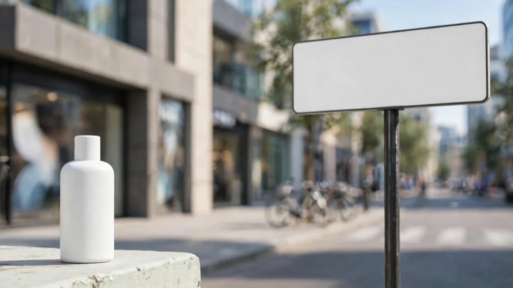
Nothing outs a video as “AI-generated” faster than lettering. Picture it: a beautiful street scene, good light, a character you actually like — and then the shop sign behind her reads something like “Cafee Opan Daily,” in letters that melt a little more every frame. Viewers might not consciously catalogue it, but they feel it. And the comment section definitely catalogues it.
In my own production work I settled this question a while ago, with a rule I don’t bend: if the audience has to read it, the generator doesn’t make it. Generation handles the street, the light, the person. Letters get added later, in the edit, where they stay spelled correctly. This article walks through the whole approach — why models mangle text, how to prompt scenes that need no text at all, which negatives help on text you can’t avoid, the clean-plate method step by step, and when real text genuinely has to be shot or composited.
Why Models Dream In Alphabet Soup
Understanding the failure makes the strategy obvious. A video model doesn’t know what words are. It knows what lettering looks like — the rhythm of signs, labels, book spines, screens — and it reproduces the look with tremendous confidence and zero literacy. Short, common words sometimes survive because their shapes are deeply familiar. Anything longer, rarer, or brand-specific? Improvised.
Worse, the improvisation is unstable. Because each stretch of frames re-settles the detail, lettering doesn’t just come out wrong — it comes out wronger over time, shifting and re-spelling itself. That temporal wobble is why AI text feels more disturbing than a single bad still. A wrong poster in a photograph is a prop error. A poster that re-spells itself on camera is a glitch in reality. Viewers read it instantly.
Logos suffer the same fate, with higher stakes. A logo is a precise shape with legal and commercial meaning, and “nearly the logo” is worse than no logo at all. It looks like a knockoff, it misrepresents the brand, and in client work it can end the relationship. I treat generated logos as defects by default. If a real brand appears in my footage, it got there through the edit — from the real artwork, with permission. Or it doesn’t appear at all.
Now, the conclusion I draw from all this isn’t “avoid text forever.” Plenty of shots want signage, screens, and packaging; they give scenes their lived-in credibility. The conclusion is that text has to be assigned to the stage of production that can actually do it. Cameras and generators make worlds. Editors make words. Keeping that division clean is the whole game, and the rest of this article is mechanics.
Prompting Scenes That Need No Text
The cheapest text fix is a scene that never asks for lettering. This is a design choice, made on the storyboard — and it’s easier than creators expect, because most shots don’t need readable text. They need the suggestion of a world. A café reads as a café through tables, cups, light, and people; the menu board can be soft in the background, turned away, or simply out of frame. A street reads as a street through architecture and movement; signage can be implied by shapes and colour blocks the audience never gets close enough to judge.
In the prompt, I describe the text-bearing surfaces as quiet ones. “A quiet café, soft morning light, a few empty tables” gives the model nothing to spell. Where a surface is unavoidable, I describe it as plain by design: “blank awning,” “unmarked storefront,” “a plain menu board with no writing” — phrased as set dressing rather than bans. Camera choices help as much as words. Keep signage at the edges, keep it out of the focal plane, let depth of field soften it, and never park the camera squarely in front of a sign and hold. The audience forgives atmosphere. It does not forgive a hero shot of gibberish.
There’s a taste point here too. Beginning creators often pile on signs, posters, and screens because they think detail equals production value. Watch professional footage back and you’ll notice how little readable text actually appears — and how deliberately it’s placed when it does. Restraint reads as confidence. My boards mark text risk explicitly. If a panel can be recomposed to drop the lettering, it is. That twenty-second decision on paper routinely saves a generation, a fix, or a reshoot downstream.
Negatives For Signs, Labels And Screens
When text-bearing surfaces are unavoidable — a market street, a shop interior, packaging in a product story — negatives do reduce the damage. I run a small aimed set: gibberish text, fake letters, misspelled words, changing text, warped logo. Five terms, aimed at the failure family. They cut the frequency of full alphabet-soup moments and, just as usefully, they push remaining lettering toward vague, low-contrast shapes that read as texture rather than errors.
Combine negatives with the oldest trick in cinematography: focus. Lettering that sits behind your subject, a stop or two soft, becomes atmosphere. Lettering beside your subject, sharp, becomes a headline the audience tries to read. So my prompts pair the negative set with focus language — “shallow depth of field, background softly blurred” on character shots in texty environments — and my boards keep the sharpest plane of the image on faces and products. Never on signage. Where a tool offers no negative field, the folded version works: describe the surfaces as blank or illegible-by-design, “distant signs too far to read,” which is both true to the shot and a description the model can build.
Limits, as always, stated plainly. Negatives won’t make a close-up label correct, won’t hold a sign steady through a long camera move, and won’t save a shot built around a screen full of text. If your take keeps failing on lettering specifically, the lettering is misassigned work. Move it to the edit. The next section is the method for doing exactly that, and it’s the one I use on essentially every project now.
The Clean-Plate Method: Generate Blank, Add Text In Edit
The clean-plate method is simple to describe and — once you’ve done it twice — hard to imagine working without. You generate the shot with the text surface deliberately blank: a clean sign, an empty screen, an unmarked label. Then you add the real text in your editor, tracked to the surface, where it stays sharp, correct, and identical in every frame. The generator does what it’s good at: the world, the light, the movement. The editor does what it’s good at: letters.
Step by step, the way it runs in my pipeline. On the storyboard, the panel marks the surface and what the final text must say — decided now, while changes are free. In the prompt, the surface is described as blank and plain: “a blank white sign above the door,” “an empty phone screen,” “a plain label with no writing.” If the tool has a negative field, I add a full text ban for this shot only — text, letters, words, logo, writing — because here, unlike a general scene, a truly empty surface is exactly what I ordered. Generate as normal, and QC the surface specifically: it should be clean, evenly lit, and stable, because stability is what makes tracking easy later.
In Premiere, the text goes on as its own layer: real words, real font, the client’s actual logo file if a brand is involved. For a static camera it can be as simple as a positioned title with a slight perspective match. For a moving camera, I track the surface — Premiere’s mask and tracking tools handle modest moves fine — and let the text ride the shot. Add a whisper of the scene’s grain and colour over the composite so it sits in the footage rather than on it. The whole job takes minutes once it’s habit, and the result outperforms generation on every axis that matters: correct spelling, correct logo, stable across frames, changeable in ten seconds when the client renames the product. Try getting that from a re-roll.
This method also quietly solves revision hell. Text is the thing clients change last and most. When the words live in the edit, a revision is a retype. When the words live in the generation, a revision is a new generation, new QC, new luck. I know which invoice I’d rather send.
When Real Text Must Appear: Shoot It Or Composite It
Every so often a shot genuinely centres on text — a book cover reveal, a phone screen the story turns on, a storefront that is the subject. Then the decision tree is short. If the object is real and available, shoot it: a few seconds of phone footage of the actual book, screen, or sign will beat any generation for the element the audience is meant to read, and it can be composited or cut in cleanly. If it’s not available, composite it: generate the scene as a clean plate as above and place designed artwork — a proper cover layout, a real screen recording, an actual logo file — onto the surface in the edit. Screen content in particular should almost always be a real recording or a designed still; generated screens fail on text, layout, and stability simultaneously.
What I don’t do is the third path creators keep hoping for: prompt harder until the generator spells it right. Short words occasionally land, and for a throwaway background gag that might be enough. For anything the audience is meant to read, “occasionally lands, mostly holds still” is not a professional standard — and the cost of discovering that at take five exceeds the entire clean-plate workflow. Be honest about which shots are text shots. They’re a minority in most projects. Handle them with the tools built for text and let generation carry everything else — which is, not coincidentally, how the rest of my Premiere editing workflow is organised: generation for worlds, editing for precision.
Checking Text Frame By Frame Before Delivery
The last habit is QC, because text failures love to hide. A sign can be clean at second one and soup by second four; a logo can hold through the shot and warp on the final frames as the camera settles. Watching once at full speed will miss the moment it goes wrong — the same way it misses every temporal defect. So text gets its own pass in my QC checklist: any frame containing lettering, signage, packaging, or a screen gets paused, stepped through, and read. Actually read, the way a viewer would. If I can’t read it comfortably, it either was designed to be unreadable atmosphere (fine, if it stays vague and stable) or it gets replaced with a clean plate treatment before delivery. No exceptions for “probably nobody will notice.” Somebody always notices. That’s what comment sections are for.
Backgrounds deserve the same suspicion as foregrounds. Reflections are the sneak attack here — lettering reversed in a window or a glossy counter can carry gibberish into an otherwise clean shot, and fake text in a reflection is exactly as readable as fake text on a wall. When I frame-step a finished clip, reflections get read too. If one misbehaves, a slight reframe or crop in the edit often solves it; if not, that take loses to a cleaner sibling. Fitting place to land, I think: none of this requires the generator to learn spelling. Prompt scenes that don’t need text, negate the text you can’t avoid, generate blank plates for the text that matters, and add real words in the edit where words belong. Your footage stops outing itself, your clients stop fearing their own logos, and the alphabet goes back to being set dressing instead of a confession.