
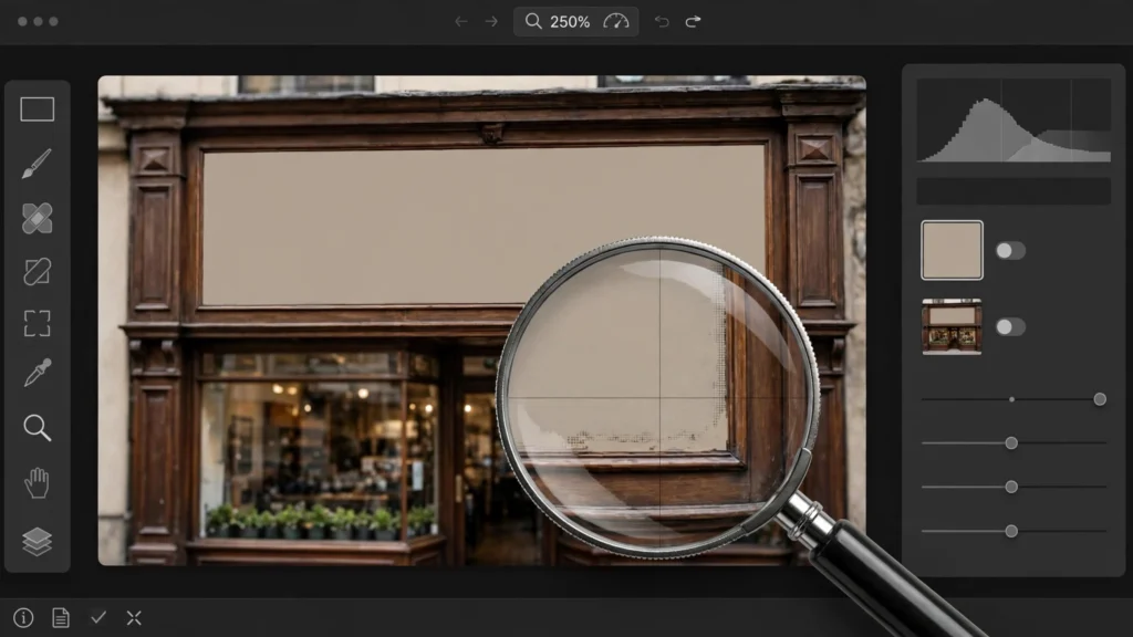
Nothing breaks a generation faster than a sign that says almost-words. I’ll be real with you: viewers may forgive a soft hand. They will not forgive garbled text. They’ll screenshot it and share it. We run text checks on every take that reaches our Premiere timeline, because in short-form especially, a logo, shopfront, book cover, phone screen or T-shirt slogan sits right where the eye goes.
The good news? This is one of the most fixable families of defects in the edit. Provided you catch it before your audience does. That’s the whole game.
Spot The Gibberish Before Your Audience Does
Here’s the trap: your brain auto-corrects text while you watch motion. You see a cereal box, your mind supplies a sensible brand, you move on. But your viewer? They’re pausing. Zooming. Commenting. They read. They don’t auto-correct — they dissect.
So we look for text deliberately, in the way it actually gets watched. Our check is boring. And it works.
Export or preview the sequence, then scrub slowly through any shot containing signage, screens, packaging, clothing text or paper. Pause on the frames where the text is largest. Read it letter by letter. Out loud if you have to — yes, really, out loud. If you can’t read it cleanly at pause, it’s gibberish at speed. Speed just hides it from you, not from the screenshot.
- Check the background signs too. Hero text gets scrutinised; the café awning behind the actor does not. Audiences find the awning. They always find the awning.
- Check reflections and screens. A phone screen that clearly shows scrambled characters reads as fake faster than a blurred one. Scrambled and visible is the worst combination.
- Check after reframing. A 9:16 crop can promote background text you barely noticed in 16:9 into the centre of frame. Suddenly the extra is the star.
- Check logos on clothing and props. Invented brand marks look like counterfeit merchandise, which carries its own problems.
We flag text problems during the same review pass described in our AI video QC checklist — with one difference. Text gets a pause-frame inspection, not a playback-speed one. Everything else we judge in motion. Text we judge standing still. Because that’s how it will be judged online.
Blur, Crop And Cover: The Fast Three
Most bad text doesn’t need rebuilding. It needs to stop being readable. Those are different jobs — and the second is much quicker.
Blur first. If the text is background dressing — a sign nobody needs to read — a masked blur or a slight defocus turns gibberish into set dressing. People accept unreadable background text in real footage constantly. Shallow depth of field does it in every film. What they don’t accept is almost-readable text, because almost-readable invites reading, and reading exposes it. Almost-readable is a trap.
Crop second. Signage lives at frame edges a lot of the time. A modest reframe — the same 105–115 percent scale we use for half the rescues in our bay — pushes the offending sign out or tucks it behind the edge. Just check you’re not cropping into a head or a hand to save a sign. Bad trade.
Cover third. A lower-third, a caption bar, a reaction cutaway, an insert — if the story gives you anything honest to put over the text for its worst seconds, use it. Captions in particular earn their keep here. Viewers are already reading them, and a caption sitting over a scrambled street sign looks like a design choice. Nobody suspects a thing.
- Match the blur to the shot. A heavily blurred sign in an otherwise deep-focus scene looks like censorship. Light blur, plus grain, usually passes.
- Do not sharpen your way out. Sharpening garbled letters makes confidently garbled letters. Enhancement cannot invent the word the model failed to write. It’ll just fail louder.
- Watch moving signs. A sign on a passing vehicle needs the blur tracked, or the blur slides off and the gibberish waves at the camera. Awkward for everyone.
The fast three handle the majority of what we see. They fail when the text is the point of the shot — and that case deserves a proper rebuild, not a disguise.
Clean Plates: Rebuilding A Blank Surface
Sometimes the surface should exist but the words should not. A shopfront with a blank awning. A book with an unmarked cover. A laptop screen showing nothing in particular. The clean-plate route removes the model’s failed attempt and returns the surface to neutral — which is often all the scene ever needed.
In Premiere our usual build is a clone from within the same shot. Most surfaces have a clean patch somewhere: an unlettered stretch of the same wall, the same awning a second earlier before the text drifted. We freeze that patch, mask it over the lettered area, feather the edges, and track or keyframe it to follow the shot. Same-shot donors match light and grain automatically. That’s why this beats importing a texture from anywhere else, every time.
Where the surface itself is also warping, generative fill gives you a stronger starting point — describe a blank version of the surface and let the tool rebuild the region without text. We cover that workflow in our guide to inpainting and outpainting for video. Whichever source you use, two details sell the plate: grain, and imperfection. A surgically clean patch in a lived-in scene reads as a patch. Re-apply the shot’s grain over your repair, and let the edges be a touch soft.
- Feather more than feels necessary. Mask edges are where clean plates confess. When in doubt, feather wider.
- Keep the surface’s shading. If the original sign sat in shadow gradient, your blank version needs the same fall-off or it glows. Glowing blank signs are suspicious.
- Rebuild in the surface’s perspective. A flat patch pasted onto an angled wall fails instantly. Corner-pin it to the plane. Respect the geometry.
A clean plate is also the right foundation when real text goes back on later — which is the next job.
Compositing Real Text And Logos In Premiere
When text must be read — your brand, the video’s title on a storefront, a phone message the story depends on — put real text on in the edit. This is not a workaround. Films do exactly this. It’s simply the correct division of labour: the model builds the world, the edit writes on it.
Our Premiere method is plain. Build the text as its own graphic layer, styled to the scene — a sign gets a sign’s typography, a phone message gets a phone’s. Place it over a clean-plated surface. Then do the unglamorous work that sells it: match the perspective, match the softness, match the light.
- Perspective first. Use the corner-pin controls in the Effect Controls panel to seat the text on the surface’s plane. Eyeball it against the surface’s real edges.
- Soften to the shot. Generated footage is rarely tack sharp. Text at full vector crispness floats. A whisper of blur — less than you think — settles it in.
- Dirty it slightly. Reduce opacity a fraction, let the shot’s grain layer sit over the text, and match white levels to the scene instead of leaving text at pure white. Perfect white text is a confession.
- Respect the light. A sign in shadow should not be brighter than a face in sunlight. Pull exposure down to the surface, not up to legibility.
Logos need one extra caution: use only marks you have the right to use. Your own brand — fine. A real company’s logo placed into a scene implies an association that may not exist, and platforms and brands both notice. When in doubt, invent a neutral name, typeset it cleanly, and move on. An invented café name reads as production design. A borrowed trademark reads as a claim.
Tracking Text Onto Moving Shots
Static shots are forgiving. Moving shots? That’s where composited text goes to slide around and embarrass you. The discipline is simple to state: make the text move exactly like the surface it lives on. No more, no less.
We start with Premiere’s mask and motion tracking on the surface itself. Pick a high-contrast corner of the sign or screen, track forward, and check the track on the frames where the camera moves fastest — because that’s where tracks drift. If the surface rotates in perspective, track the plane, not a single point. A single-point track keeps position and loses the skew, and text that keeps its position while the wall rotates looks drunk. Actually drunk.
- Track the worst section first. If the track survives the fastest camera move, the gentle parts will take care of themselves.
- Hand-fix drift at the ends. Tracks commonly wander in the last few frames. A couple of manual keyframes there is normal, not failure.
- Add the camera’s flaws. Slight motion blur on fast moves and a touch of the shot’s grain keep the text in the same physical world.
- Know when to cut instead. A long, rotating, occluded surface is a compositing project. If the text only matters for two seconds, cut to a closer, simpler angle for those two seconds.
Short version: the text should inherit the shot’s problems. Perfectly stable text on an imperfect shot is the loudest fake in the frame. Perfection is suspicious. Remember that.
The Prevention Rule: Text Is An Edit-Stage Job
Everything above gets radically easier when generation stops attempting the words. Our standing rule — built into our prompt to final cut workflow — is simple: prompts describe text, they do not dictate it.
In practice that means we prompt for surfaces, not spellings. “A café awning” — not an awning with a quoted name. “A phone showing a message,” with the message left to us. Where a model does attempt letters, we assume the attempt failed until the pause-frame check proves otherwise. Trust, but verify. Actually — don’t trust. Verify.
Text-heavy story beats — the note, the headline, the chat thread — get planned as edit-stage composites from the start. Shot wide and simple, so the composite has an easy surface to sit on.
This one habit removes an entire category of regeneration. You stop re-rolling generations hoping the model spells better this time. It won’t. Reliably, it won’t. And hope is not a workflow.
Frequently Asked Questions
Can AI Video Generators Spell Text Correctly?
Sometimes. On short simple words, with luck. Not reliably enough to build a workflow on — and that’s the bar that matters. Plan for text to be added or repaired in the edit, and treat any correctly spelled generation as a pleasant accident. A gift. Not a strategy.
How Do I Remove Unwanted Text From An AI Video?
Fastest first: blur it if nobody needs to read it, crop it out if it sits near an edge, or rebuild the surface with a clean plate cloned from the same shot. Generative fill handles stubborn regions where no clean donor patch exists. Three speeds, one principle: stop it being readable.
Can I Add My Logo Onto A Generated Shot?
Yes — composite it as a graphic layer in the edit, corner-pinned to the surface, softened and grained to match the footage. It looks far more convincing than prompting the model to render your logo, which it will approximate and distort. The model is a dreamer, not a typesetter. Let it dream; you do the typesetting.
Why Does Text Look Fine While Playing But Wrong When Paused?
Motion hides letter shapes and your brain fills in expected words. Pausing removes both protections. Judge all text on paused frames, at the largest size it appears in the edit. The pause is the truth serum.
Write It In The Edit
That is the whole philosophy, really. Generation is brilliant at places, people and light. It is a careless typesetter. So stop asking it to typeset. Catch the gibberish with a pause-frame check, blur or crop what nobody needs to read, rebuild the surfaces that matter, and put real words on in the edit where words belong.
Do that and text stops being the thing that gives your videos away. It becomes part of the finish. Under your control. Spelled the way you intended.