
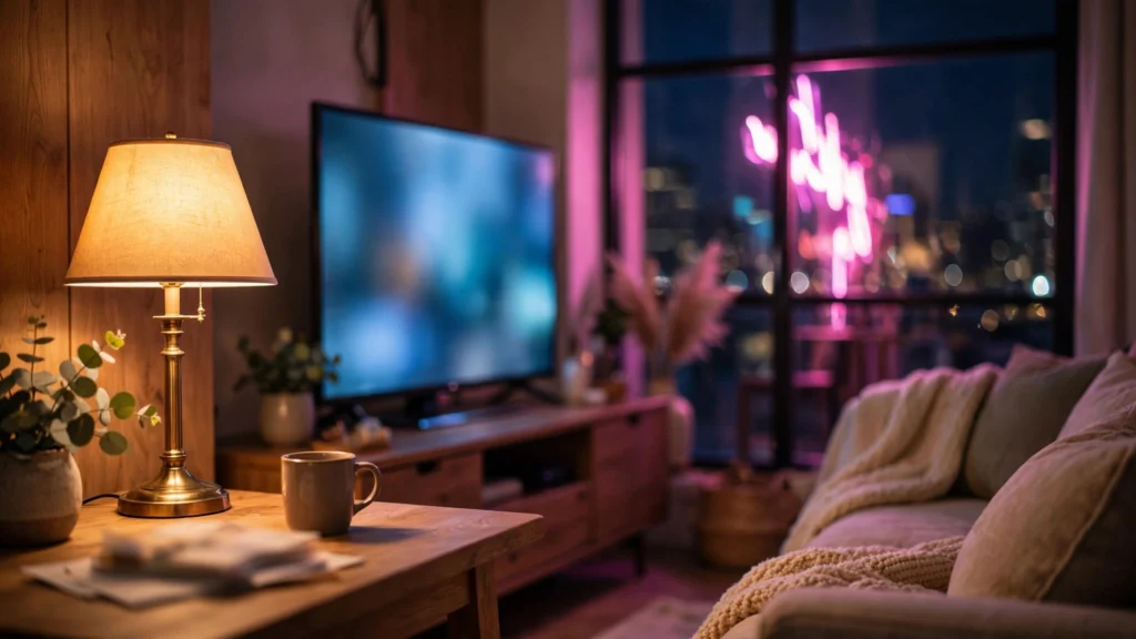
Here’s a quick test I run on generated interiors: where’s the light coming from? If I can’t point at something in the frame — a window, a lamp, a glowing screen — the shot usually feels fake. Even when everything in it is rendered beautifully.
Why? Simple. Viewers may not think about lighting, but they audit it constantly — unconsciously. Light from nowhere reads as a rendering. In real rooms, light always comes from somewhere.
Cinematographers solved this ages ago with practicals: light sources that appear inside the picture and motivate the illumination. Visible sources do double duty. They light the scene and explain the light at the same time. For AI video, practicals are the cheapest realism upgrade there is — and they cost nothing but prompt words. On our location boards we mark the practical sources before a single generation happens; this guide covers the ones that matter, and how to prompt them so they glow instead of detonating.
Light The Viewer Can See Is Light They Believe
Motivated lighting means every pool of brightness has a cause the viewer can find. A face lit warmly from frame-left is more believable when a table lamp sits at frame-left — even if that lamp could never really throw that much light. Film crews cheat this constantly. Visible lamp’s dim; a hidden studio light does the real work. The viewer’s brain only checks for a plausible source, not a sufficient one. Models learned from that same footage, so naming a source in the prompt often organises the whole frame’s lighting around it.
Practicals fix a colour problem too. Unmotivated AI scenes drift toward one neutral wash. The moment you name “a warm tungsten lamp” and “a cool phone screen”, the model’s got two colours to play against each other — and warm-against-cool is the oldest trick for making a frame feel rich. You can add the phrase “motivated lighting” itself — some models respond to it — but the named objects do the real work. One source is a claim. Two sources at different temperatures? That’s a lighting design.
And there’s a composition bonus. A practical is a bright object, and bright objects pull the eye. A lamp behind a subject’s shoulder gives the viewer a depth anchor and gives the subject a rim of separation from the background. When I review storyboards for flat panels, half the time the fix isn’t composition at all. It’s a motivated source in the back of the frame. This connects directly to lighting prompts for AI video, where sources are the building blocks; here we care about the ones you can see.
Windows: The Hardest-Working Practical
One light source per room? Make it a window. Windows justify everything: bright daylight, soft overcast wrap, golden raking beams at day’s end, blue dusk, rain glitter. They also hand the model an easy geometric job — a bright rectangle with plausible glow falloff — and they give the editor-in-you a free depth device, because anything between camera and window crosses the light.
Prompt windows with the specificity you’d give a set designer:
- Size and placement: “large window camera-left”, “narrow window behind her”, “floor-to-ceiling windows along the back wall”. Placement is direction; direction is shadow logic.
- State of the glass: “blinds half open, stripes of light across the floor”, “sheer curtains diffusing bright daylight”, “rain running down the window, city lights blurred beyond”. Each state changes the light’s character, not just the view.
- Time through the glass: a window is a clock. Bright white says midday; amber says late; deep blue says the scene happens while the world outside has gone home.
Face placement matters as much as the window. A subject between camera and window is a silhouette unless you ask for fill. “Face turned three-quarters toward the window light” is the classic portrait arrangement, and models render it well. A subject facing the window, camera behind: full modelling on the face, bright backdrop — and it needs the exposure note “detail held in the bright window, not blown out”. Watch the classic failure where the window becomes a white hole with a hard edge. Curtains, blinds, “soft glow spilling into the room” — they all soften that edge in the render.
One more honest habit: decide whether the window is the key light or just set dressing. If a lamp’s supposed to dominate a night interior, say the window is dark — or the model will blast daylight through it out of pure optimism. Night windows should be “dark blue, faint city glow”. Written down, not assumed.
Lamps And Screens: Interior Realism
Lamps are the night shift of motivated lighting. A table lamp with a warm shade explains a golden pool on a desk, a face lit from one side, a cosy island in a dark room. The prompt details that matter: the shade (it traps the light into a cone and keeps the bulb from becoming a star) and the temperature. “Warm amber light from a shaded table lamp” gives the model colour, direction, softness — six words. Bare bulbs read harsher, more urban. Candles read intimate and unstable. “Candlelight flickering gently” is a lovely phrase, but keep faces near the flame — candlelight dies with distance, and the model knows it.
Screens are the modern practical, and they come with a gift: they justify cool light at night. “Face lit by a cool laptop glow, warm lamp behind” is a complete night-interior design that anyone in 2026 recognises from their own life. Phones light faces from below in bed. Monitors wash desks in blue-white. A TV paints a living room in slow colour changes. Use the behaviour, not just the object: “TV light shifting softly across the room” tells the model the illumination should breathe. Keep screen content vague — “glowing monitor, no readable text” — because generated text on screens still garbles, and a nonsense interface will steal the shot.
Small working rules from my own generations: one lamp per pool of light. Two lamps, two pools — or the frame turns into a showroom. Lamps at plausible heights, so name the furniture: “lamp on the side table”, “floor lamp in the corner”. And when a character touches the source, you win twice — a hand switching on a lamp is both an action beat and the moment the scene’s lighting explains itself. That switch-on moment, boarded properly, is one of the most satisfying cuts in short-form work.
Neon And Signs: Colour With A Source
Neon is practical lighting with the volume cranked. A pink sign doesn’t just sit in the frame; it dyes faces, streets, puddles pink. That dye job — colour with an obvious cause — is exactly why neon footage reads as photographed even when it’s heavy. The model gets a source, a colour, a direction, all in one object. Street scenes, bars, night markets, barbershops, arcades: neon hands you production value that’s hard to justify any other way.
The failure mode is excess. Prompt three neon colours and the frame becomes a gaming keyboard. Skin tones drown. Every surface turns to candy. My rule for lead scenes: one dominant neon source, one supporting colour at most (a cyan edge from a second, smaller sign is the classic pairing), neutral darkness doing the rest. Write cause and effect: “magenta neon sign above the shop, pink light washing the wet pavement and the side of her face, deep shadow on the opposite side”. The shadow clause matters. Neon without shadow is a screensaver. Neon with a dark side is cinema.
Sign text gets the same caution as screens. If the sign must say something, keep it to one or two common words and accept a re-roll or two. Or better: go abstract — “glowing neon sign, abstract shapes, no readable text”. Viewers read the glow, not the lettering. Reflections multiply neon’s value — wet ground, glass storefronts, car roofs — and they’re reliable wins. “Reflections doubling the neon in the wet street” is a phrase that’s paid for itself many times over. For how these shots finish in the grade, our color grading AI footage guide covers protecting saturated sources from clipping.
Prompting Practicals Without Blowing Them Out
Every practical fights the scene’s exposure, and models regularly lose that fight. Lamps become white suns. Windows become voids. Neon melts into fog. The causes are fixable in wording. Models default to making named bright objects very bright — so give brightness a ceiling and the rest of the frame a floor.
- Give the source a shade, a dimmer, or a distance. “Shaded lamp”, “dim warm bulb”, “small lamp across the room” — each physically caps the output.
- Ask for held detail. “Detail visible in the lampshade”, “window bright but not blown out, garden visible beyond”, “neon tube edges crisp”. Models understand “not blown out” surprisingly well.
- Protect the subject’s exposure. “Face correctly exposed, lit softly by the lamp” tells the model where the exposure priority lives. Without it, the lamp wins and the face goes dark, or the reverse.
- Say what the light lands on. “Lamp light pooling on the desk and her hands” localises the brightness instead of flooding the room — pools read expensive, floods read cheap.
- Mind the count. Three competing practicals in three colours is a lighting design only experts survive. When in doubt, demote two of them: “a second lamp, unlit, in the background” keeps the set dressing without the fight.
Review practicals at the extremes: pause on the brightest frame, check whether the source still has shape. If every generation blows the same lamp, the fix is usually a smaller source placed farther away — not stronger wording about exposure. I also keep practicals consistent across a sequence the way I keep wardrobe consistent. A lamp burning warm in shot one and cool in shot three breaks the room. The light line on the location sheet names the practicals, their colours, their positions — exactly for this.
Practicals As Storytelling: Who Owns The Light
Once practicals are technically under control, they turn into storytelling instruments — because light sources in a frame are never neutral. The person standing in the window light owns the scene. The one in the corner dark is hiding, waiting, or losing. A character who switches on a lamp changes the power in the room, and the audience feels the scene brighten around their decision. A character lit by their own phone at 2 a.m. tells you about their life without a word of dialogue.
Patterns worth boarding deliberately:
- Source as territory. Two characters, one warm lamp between them — whoever leans into its pool is winning the conversation. Move the lamp (in the board, then in the prompt) and you move the story.
- Source as clock. Daylight window, then lamps, then a single screen: three shots, an evening passing, no captions needed. Time-of-day sequences built from practicals are the easiest continuity there is.
- Source as reveal. A door opening spills light into a dark room; a fridge door lights a face at midnight; headlights sweep a wall before the car is seen. The cause arriving before the object is a classic suspense beat that generators handle well because the motion is simple.
- Source as character. The neon sign that buzzes and flickers over a failing shop is doing acting work. Give one practical a behaviour — flicker, sway, hum implied by a slight glow pulse — and the room gains a personality.
All of this gets decided cheapest on the board. When I mark practicals on a location sheet — window here, lamp there, sign outside — the prompts practically write themselves. The sequence stays consistent. And the finished footage carries that quiet quality viewers call “it looks like a real film” without knowing why.
It looks real because the light had a reason. Give every scene at least one reason the viewer can point at, and you’re most of the way there. For how those marks fit the full planning method, see the storyboard-first workflow.