
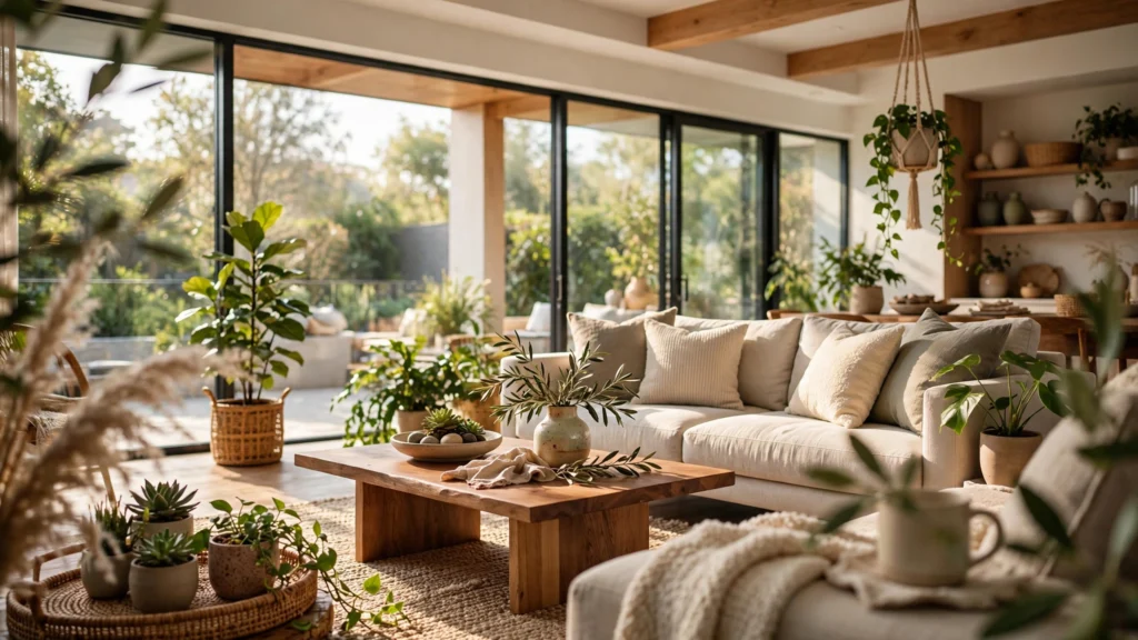
Generated rooms have a tell. And once you see it you can’t unsee it: they look like furniture showrooms. Everything is new, evenly lit, arranged for a photograph — with a sofa aimed at nothing and a plant standing guard in the corner.
Real rooms are the opposite. A bit worn. Lit from one side. Layered with the evidence of a person who actually lives there. The gap between the two isn’t rendering quality. Seedance 2.5 and Veo can render a believable kitchen down to the crumbs.
The gap is set design.
When you prompt “a cosy living room”, the model retrieves the average living room — and the average living room in its training data is a catalogue. When you prompt a room the way a set decorator would describe it — window first, layers of furniture, objects with jobs — the model retrieves a place instead. Our location sheets are built like set designs for exactly this reason. This guide walks through the method: light excuse, depth layers, lived-in logic, and the off-screen space that makes a room feel bigger than its frame.
The Showroom Problem
Showroom energy has four symptoms, and it helps to name them because each has a different cure. First, centre-aimed furniture: sofas and tables floating in the middle distance, facing the camera like a product shot. Second, uniform light: brightness arriving evenly from everywhere, which no window has ever done. Third, empty surfaces: counters, desks, and shelves with nothing on them, because clutter is hard and the model plays safe. Fourth, depth collapse: everything interesting sits in one plane, with bare wall behind.
Notice that none of these are “AI artefacts” in the usual sense. There’s no melted hand to fix, no warped face. The room is competently drawn and spiritually empty. That’s why adjectives fail here — “realistic, lived-in, cosy” are requests for an outcome, and the model needs the ingredients instead. The ingredients are concrete and listable, and the rest of this guide is that list, in the order I build a room: the light excuse, the three layers, the evidence of life, and the exits.
A word on why this matters commercially — since much interior work is product and lifestyle work. Viewers trust rooms before they trust claims. A skincare product on a real-feeling bathroom shelf borrows the room’s credibility; the same product in a showroom void borrows nothing. Interiors are persuasion infrastructure. Getting them right is worth a location sheet and ten extra prompt words.
Windows First: Every Room Needs A Light Excuse
I start every interior with the window. Before furniture, before the subject. The window decides where light enters, which decides where shadows fall, which decides where faces can stand and remain readable. It also decides the time of day the room believes in. A generated interior without a named window gets its light from the camera’s general direction — flat and sourceless — and no lamp added later will fully rescue the geometry.
(If you’ve read our piece on lighting prompts for AI video, this is the same principle indoors: name the source, get the scene.)
Prompt the window like a gaffer would: placement, size, covering, and state. “A tall window camera-left with sheer curtains, bright morning light spilling across the floorboards” gives direction, softness, time, and a visible light pool on the floor. Four anchors in one clause. Blinds deserve special respect: “venetian blinds, bands of light across the desk” manufactures graphic depth out of nothing and hides a plain room behind pattern.
At night the window changes jobs. It becomes the dark mirror with city glow — and should be declared: “window dark behind her, a few distant apartment lights”, or the model may invent daylight out of habit.
Placement against the subject is the portrait decision. Subject beside the window: modelled, dimensional, the classic. Subject backlit by it: moody, rimmed, needs “soft fill on the face from the room” to stay readable. Subject facing it, camera behind: full honest light, great for cooking, crafting, any hands-at-work scene. Pick one and write it. The model won’t pick the same one twice across a sequence unless you do. That consistency across shots — same window, same side, same time — is what lets separately generated clips cut together as one room, and it goes on the location sheet verbatim.
Foreground, Middle, Background: Furnish In Layers
Showrooms are flat because everything in them lives at the same distance. Real rooms — and every good film set — are built in three layers. Furnishing in layers is the single most effective interior prompt habit I know. The foreground might be the edge of a bookshelf sliding past out of focus, the shoulder of a doorway, the back of a chair. The middle holds the action: the table, the counter, the person. The background carries the room’s biography: shelves, a stove, a hallway, coats on hooks.
Prompt each layer with a job, not just an object. Foreground creates depth and a sense of standing somewhere: “out-of-focus bookshelf edge in the near foreground”. Middle carries the subject and the best light. Background must be busy enough to believe and quiet enough not to compete: “kitchen shelves behind, jars and pans slightly soft”. That “slightly soft” is doing professional work — it mimics depth of field, which cues the viewer’s brain that a lens photographed this. Deep focus has its place (architecture, tiny apartments where the whole room is the information), but selective softness is the default language of filmed interiors.
Furniture placement follows from layers. Anchor pieces to walls and windows the way people actually arrange rooms: “sofa against the back wall under the window, coffee table between it and camera, armchair angled at the side”. Angled beats parallel — a chair turned slightly toward the table feels inhabited; a row of furniture facing camera feels staged. Leave walking paths empty. It sounds obvious, but a generated room where you can’t imagine the route from door to window will quietly bother every viewer. Our boards literally sketch that route; the prompt inherits it. For the composition theory underneath all this, the storyboard-first workflow covers how panels lock layers before generation.
Lived-In Detail Without Junk
Between showroom and hoarder den runs a narrow, golden band: evidence of life. A mug on the counter. A jacket over a chair back. Books stacked, not shelved. A plant that’s healthy but not symmetrical. These objects convince because they imply a before and an after — someone made tea, someone came home. The prompt craft is in choosing evidence with a story thread and placing it with restraint: three to five pieces per room, each plausible for the character who lives there.
A useful way to choose: give the room’s owner one habit and let the clutter express it. The cook’s kitchen earns a knife strip, a chopping board left out, herbs on the sill. The student’s desk earns stacked notes, a lamp, a second mug. Generic clutter — “some books and objects” — produces generic set dressing; specific clutter produces a person. Specificity is also cheaper in words than it looks: “a half-finished mug of tea beside the keyboard” is nine words and builds a whole morning.
Restraint rules that keep detail from turning to junk. Keep surfaces sixty percent clear; real people wipe counters. Keep detail off the floor unless the story lives there; floor clutter reads as squalor fast. Wear should be gentle — “slightly worn armchair” good, “dirty, messy room” will drag the whole render toward grime. And keep faces and hero products out of the clutter war: detail belongs at the frame’s edges and behind the subject, not competing at centre. When a generation returns a room that feels busy and fake at once, it’s usually clutter without a habit behind it. Rewrite the habit, keep the words.
Doors, Hallways And Off-Screen Space
Real rooms connect to other rooms. Showroom renders are boxes — four walls and no exits, as if the occupants were beamed in. The viewer notices the box subconsciously: nowhere to enter from, nowhere to go. The cure is cheap: one opening. “An open doorway behind him leading to a dim hallway” instantly triples the implied apartment. The hallway beyond can stay vague — a lit rectangle, a coat hook, a door ajar with light under it — because suggestion is all off-screen space needs.
Openings also do camera work for you. A doorway is a frame within the frame — the oldest depth trick in cinema. A character crossing from the dark hallway into the lit kitchen has a built-in entrance, and entrances are story beats. Prompt them: “she enters through the doorway at the back, crossing into the window light”. The model gets a movement with a start and an end, which it prefers — and you get a shot with genuine spatial logic.
Sound thinks in off-screen space even when prompts can’t say so directly. A room with a visible opening feels like it belongs to a larger, audible world, and your edit can then justify the fridge hum and hallway footsteps that make interiors sound inhabited. Relatedly, mind the ceiling. Low shots that catch a ceiling edge and a hanging lamp sell room height; a frame that never shows where walls end can feel like a corridor in disguise. “Ceiling beam and a hanging pendant lamp above the table” settles the architecture in eight words.
These are the details our AI video QC checklist groups under “room logic” — exits, ceiling, light source — because they’re the three checks viewers perform without knowing it.
Prompting A Room You Could Walk Through
Assembly time. Here’s a worked interior brief turned into prompt language. Brief: a small bakery kitchen, early morning, the baker alone before opening.
The prompt: “Interior, small bakery kitchen at dawn. A tall window camera-left with condensation on the glass, pale blue morning light spilling across a worn wooden worktable. In the near foreground, the soft out-of-focus edge of a flour-dusted shelf. Midground: a baker in a faded apron kneading dough on the table, sleeves rolled, a mug of tea at the corner. Background slightly soft: steel oven, hanging pans, stacked trays, an open doorway to a dark shop floor beyond. Thin haze of flour dust in the window light. Photorealistic, lived-in, quiet.”
Count the decisions: window first (light excuse, time, mood), three furnished layers, a habit expressed in clutter (tea, flour, trays), one exit, air made visible in the beam, and an exposure that knows where its subject is. Nothing in that prompt is fancy. Every clause is a noun doing a job. That’s the whole method — rooms are built from jobs, not adjectives.
The takeaway to keep: before generating any interior, write four lines on the location sheet — window and light state, three layers with their contents, the owner’s habit in three objects, the exit. Then let the prompt transcribe the sheet. Rooms built that way stop looking like showrooms, start cutting together as real places, and quietly lend their credibility to whatever you’re selling or saying inside them.