
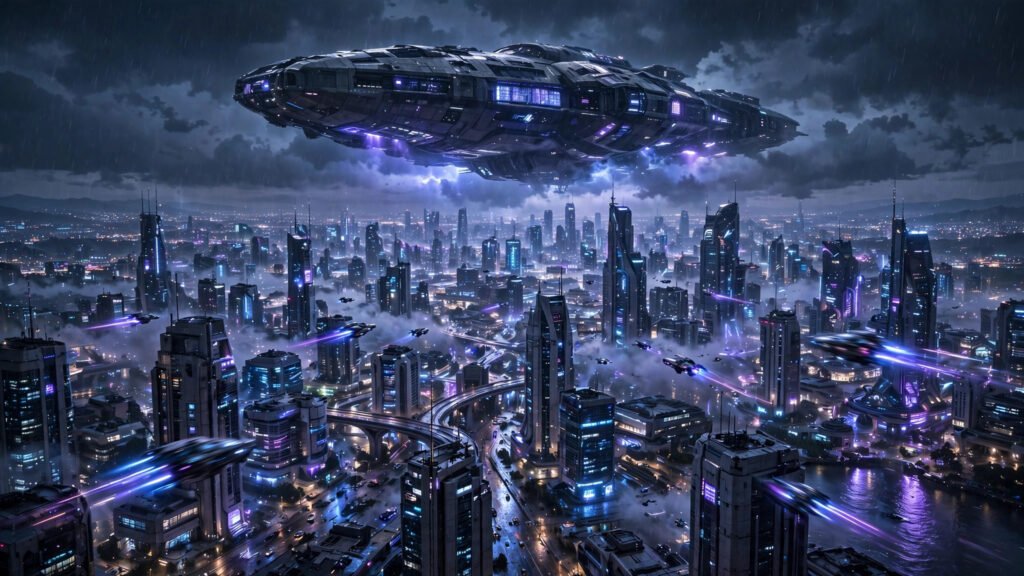
If there is one genre AI video was born to make, it is science fiction. Think about it: the hardest parts of sci-fi filmmaking have always been the expensive parts — building spaceships, constructing future cities, filming in space. AI generators do not care how expensive a shot would be in real life. A fleet of starships costs the same as a coffee cup. That is why sci-fi is where AI video looks most at home, and why audiences forgive — even celebrate — its artificiality in this genre.
In this guide I am breaking down the prompt structures that nail sci-fi: spaceships with real scale, futuristic cities that feel lived-in, deep space scenes with depth, and robots that read as machines rather than people in suits. You will also get the lighting language that sells the genre and the mistakes that make sci-fi generations look cheap. For the darker end of speculative fiction, my horror prompt guide is the natural companion piece.
Why Sci-Fi Is AI Video’s Home Turf
Sci-fi audiences are pre-trained to accept the artificial. Decades of CGI blockbusters taught viewers to read synthetic imagery as spectacle rather than deception, which means the uncanny valley that haunts photoreal AI drama barely registers here. A slightly imperfect spaceship still reads as awesome; a slightly imperfect human face reads as wrong. That asymmetry is the whole game.
The genre also rewards the things generators do best: vast environments, dramatic lighting, reflective surfaces, and slow majestic camera moves. If you are new to AI video, sci-fi is genuinely the easiest genre in which to produce impressive results quickly — which makes it the perfect training ground before tackling harder genres.
Spaceships: Prompts That Sell Scale
The difference between a spaceship shot that awes and one that bores is scale — and scale is created, not prompted directly. No model understands “make it feel huge.” You create hugeness through reference objects.
The Scale Trick
Always put something of known size near the ship: tiny blinking windows, a shuttle detaching, clouds below, a city it dwarfs. My go-to prompt skeleton: [ship description] + [scale reference] + [environment] + [lighting] + [camera move]. Example: “Colossal wedge-shaped capital ship with thousands of lit windows, tiny escort fighters flying alongside for scale, hanging above storm clouds, rimmed by cold blue engine glow, slow majestic push-in.”
“Thousands of lit windows” and “tiny escort fighters” are doing the real work there — they give the viewer’s brain the math it needs to feel size. Without a reference, even a well-designed ship reads as a toy. With one, it reads as a kilometer long.
Ship Design Language
Describe ships with industrial, functional language: “weathered hull plating,” “exposed greebles,” “asymmetric sensor arrays,” “heat-scorched engine bells.” This grounds the design in believable engineering and avoids the smooth gray blob that vague prompts produce. Decide your design lineage in the prompt too — “Star Destroyer-like wedge,” “retro 1970s sci-fi model aesthetic,” “sleek Apple-store minimalism” — because “spaceship” alone gives you the statistical average of every ship the model has seen, which is forgettable.
Futuristic Cities: Make Them Feel Lived-In
Bad AI future cities look like screensavers: clean towers, no people, no grime. Great ones feel inhabited. The prompt formula: [city layout] + [life and activity] + [weather and atmosphere] + [lighting mood]. Example: “Vertical megacity at night, layered highways with streaming light trails, crowded sky-bridges with tiny figures, low fog between towers, neon signs in rain, cyan and magenta palette, aerial drone shot descending.”
Three details separate lived-in from screensaver: weather (rain, fog and smog add instant atmosphere and hide imperfections), activity (vehicles, crowds, signage suggest a functioning world), and vertical layering (the future is up — stack your city in depth, not just across the frame). Rain is especially valuable: it justifies reflections, which make every neon source do double duty. For the camera work that sells these environments, the multi-shot sequence techniques I use for professional coverage apply directly — establish wide, push through the layers, land on a detail.
Deep Space: Planets, Nebulas and Zero-G
Space scenes fail when they are empty. A black background with a planet is a wallpaper, not a shot. The formula: [primary body] + [secondary element for depth] + [light source] + [subtle motion]. Example: “Ringed gas giant filling half the frame, small cratered moon in the foreground for depth, distant nebula glowing violet, harsh sunlight from frame left, extremely slow drift.”
Depth layering is everything in space — foreground, midground, background, always all three. And keep motion glacial. Real orbital mechanics are slow; fast camera moves in space feel wrong to viewers even if they cannot articulate why. One more practical note: stars should be subtle. Beginners prompt “starry sky” and get a snowstorm of white dots. “Faint distant stars” reads far more cinematic.
Robots and Androids That Read as Machines
The classic failure mode of AI robots is the human in a suit — a person-shaped figure with some chrome painted on. To get machines that read as machines, prompt the materials and the mechanics, not the silhouette: “brushed titanium exoskeleton, exposed hydraulic joints, glowing optical sensors, servo-motor articulation, industrial design.”
Motion sells robot believability more than appearance. Prompt deliberate, weighted movement: “moves with heavy deliberate steps, head turning with slight mechanical lag.” Smooth human-like motion on a robot breaks the illusion; slight mechanical imperfection makes it. And keep robots away from complex hand interactions — AI hands are the genre’s Achilles heel regardless of how chrome-plated the arm is. Frame hands out, or keep them still.
If your robot needs to speak, generate the visual silent and add voiceover in post. The AI voice tools I compared include options that can give your android anything from a warm assistant tone to a cold machine rasp — casting the voice is half the character.
Lighting: The Secret Sci-Fi Ingredient
If I had to name one thing that separates amateur sci-fi generations from stunning ones, it is lighting language. Sci-fi lighting has a vocabulary, and using it transforms outputs: “volumetric god rays” for scale and majesty, “neon rim lighting” for edge definition on dark subjects, “practical light sources” (the scene’s own lamps, screens and engines lighting the shot) for believability, “high contrast chiaroscuro” for drama.
Always name your light sources in the prompt. “Lit by the ship’s own engine glow and a distant blue star” gives the model a coherent lighting logic; without it, you get flat even illumination that reads as cheap. And commit to a palette: cyan-orange, magenta-teal, cold blue monochrome. Two or three colors, disciplined. The cinematic prompt guide goes deeper on palette discipline across all genres.
Stabilizing Epic Shots: Seeds and Negative Prompts
Sci-fi’s grand scale makes its most common flaw more visible: flicker and morphing across frames, especially in detailed cityscapes where every window is a fresh hallucination each frame. The fix is the same discipline I teach everywhere: lock your seed across a sequence, generate short clips rather than long takes, and use negative prompts where your tool supports them — “morphing, warping, flickering, extra limbs, distorted geometry” are my standard exclusions for complex scenes. The full stabilization system is documented in my flicker-fixing guide; for sci-fi city shots it is not optional, it is the difference between usable and garbage.
Assembling a Full Sci-Fi Sequence
Individual great shots do not make a great sci-fi video — sequencing does. The assembly pattern I return to is: orbital establishing shot, descent through atmosphere, city or surface exploration, character or robot beat, then pull back to the epic wide. Five shots, each five to eight seconds, each generated separately with a locked seed and a shared palette. That structure mirrors how real sci-fi films open, which means audiences instantly understand the grammar.
The critical detail is palette continuity across the sequence. Decide your two or three colors before generating anything and repeat them in every prompt: if the orbital shot is cyan and orange, the city shot must be cyan and orange too. Palette drift between shots is the subtlest and most common reason AI sci-fi sequences feel stitched together rather than directed. I write the palette as a fixed clause — “cyan and amber palette throughout” — and paste it into every prompt in the batch without changing a word.
Mistakes That Make Sci-Fi Look Cheap
No scale reference. A lone ship on black reads as a toy. Always anchor size.
Flat lighting. The fastest way to look amateur. Name your light sources, commit to a palette.
Empty frames. Space needs depth layers, cities need life and weather. Emptiness reads as unfinished.
Human-smooth robots. Mechanical subjects need mechanical motion. Lag, weight, deliberation.
Overlong generations. Epic does not mean long. Generate short, cut together — morphing compounds with clip length.
Conclusion
Sci-fi is AI video’s unfair advantage: the genre’s expensive shots are free, its audiences forgive synthetic imagery, and its visual language — scale references, lived-in cities, layered space, mechanical robots, disciplined lighting — is entirely promptable. Anchor your scale, name your lights, layer your depth, lock your seeds, and keep clips short. The final frontier is, for once, the easy one. Go build worlds.